
Inking — Part 3 of 3
Monday, December 23, 2013
Labels: Digital Color / Inked / Penciled / Sequential / Sketches / Spider-Man / Step by Step / Technique / Tools of the Trade / Video
This is a cross-post with Muddy Colors — An Illustration Collective
This is the final installment of my 3-part series on inking (here are parts 1 and 2), but that doesn't mean there's not tons more to say about the craft. Having said that, talk is cheap — there's no substitute for actually doing it (or at least watching someone actually doing it). That being the case, I've put together a 1-hour inking demonstration that features fundamental mark-making, brush dynamics, and the thought process behind some of my choices.
It's a long video, so feel free to skip around. I talk for most of it (trying to channel my best Bob Ross) but there's a substantial audio delay in some parts. My apologies. If you make it all the way through, but still have questions, don't hesitate to ask in the comments section. As I said, there's quite a bit more I could say on the subject — hopefully that will eventually coalesce into a future post.
 |
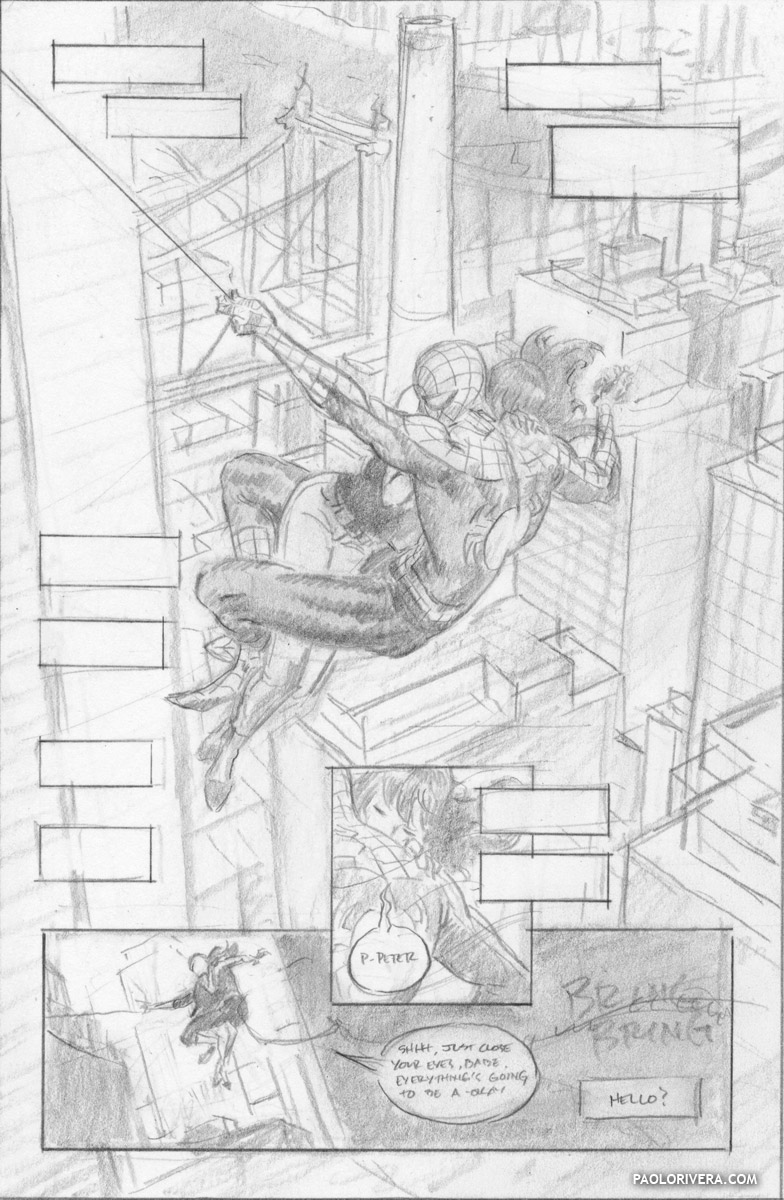
AMAZING SPIDER-MAN #640, PAGE 20. 2010.
Ink on bristol board (with digital color), 11 × 17″.
|
This is the final installment of my 3-part series on inking (here are parts 1 and 2), but that doesn't mean there's not tons more to say about the craft. Having said that, talk is cheap — there's no substitute for actually doing it (or at least watching someone actually doing it). That being the case, I've put together a 1-hour inking demonstration that features fundamental mark-making, brush dynamics, and the thought process behind some of my choices.
It's a long video, so feel free to skip around. I talk for most of it (trying to channel my best Bob Ross) but there's a substantial audio delay in some parts. My apologies. If you make it all the way through, but still have questions, don't hesitate to ask in the comments section. As I said, there's quite a bit more I could say on the subject — hopefully that will eventually coalesce into a future post.
 |
| inks |
 |
| pencils |
 |
| digital composite |
 |
| pencil layout |


Good gravy this looks good! I could learn a lesson or two in backgrounds from this. Also, do I sense a Wacky Reference Wednesday in the future when looking at Spidey's position?
ReplyDeleteDo you know, Paolo, if this (almost) flat, style of coloring is used much nowadays? I remember Marcos Martin's work being colored in a similar, old school fashion (which is fitting considering his resemblance to Steve Ditko) but other than that I haven't seen it that much. I don't think I'd ever get my puny doodles to work that well with so little changes in valeur and tone.
Happy holidays!
Thanks, Lasse! You sensed correctly (as to the Wacky Reference). Maybe some day I'll share. As for the coloring, this is just my usual style. It's not used a whole lot, but there's a handful of colorists out there who are keeping the flame alive — Javier Rodriguez and Muntsa Vicente come to mind (Javier colored me and Samnee on DD).
DeleteWill add this to my reading list and might have to um... acquire the video so I can watch and listen to it on my 12-14 hour flight to New York. (Will still be watching it on YouTube many times).
ReplyDeleteWhat I took from this, just by scanning the photos, is that I'd love to utilize grids properly or really take advantage with them. From rough to inking, the background is just amazing.
Thanks, Michael! Yeah, the grid thing is extremely useful, but it's complicated. I need to produce a whole series of videos before I release the template. Hopefully next year.
DeletePaolo, THANX a lot! This is probably the most useful/insightful video Ive seen in a while. Between this and the Photoshop perspective grid you sent me after I pestered you at Thought Bubble in Leeds 2 years ago (if you remember), I cant thank you enough ;)
ReplyDeleteOne simple question: in the video its not clear if the side of your hands touches the paper or not when you ink: Ive heard a lot of different opinions about it, and I personally find it VERY hard to ink while keeping my hand "afloat" over the page, but at the same time I find sometimes the friction of the side of my hand on the paper stops/ruins the flow of my lines, especially the longer ones?
My pleasure, Luca! I still haven't gotten around to releasing that perspective grid to the world at large. Glad to hear you've found it useful. As for your inking question, my hand is almost always in contact with the paper. The only exception I can think of is when I'm ruling lines, and I showed in the video how I use a special ruler to do that. My Dad sometimes keeps his hand above the paper, but it's steadied by his other hand which is, in turn, touching the paper.
DeleteHey Paolo,
ReplyDeleteThanks for doing this big time!! I've inked and read up on the subject before but never loved my process and felt it was still too arbitrary. This is crystal clear, as organized in presentation as it is instructive, Even better coming from one of my favorite Marvel artists,
The brush on top of a brush thing I never got until now, The "rat tail" or thick to thin stroke explained and given a name. And the all other strokes.
I just ordered that W&N Series 7, size 6 right after the video. I can't wait to use it (though its not super clear from Amazon If I'm getting the standard or miniature but sold out in other places. I think its the standard) I like inking but never really liked my strokes. I've just been intimidated going back to inking for this next comic, by just pencilling till it's time to do inks and deal. But now i have a game plan on my inking approach, much appreciated! (Next is the color, arghhh.)
Nice to hear! Hope you like it. The #6 can be a bit expensive, so be sure to take good care of it. Alway have a test strip nearby so you know what you're in for!
ReplyDeleteMuch appreciated Paolo, I got it in this weekend. It's expensive but I'm so glad to have it on my side.I don't think I've ever done convincing hair before this. I won't even go into trees, now I might have a chance. The test strip is definitely noted, It seems like one has to be part Leonardo to have a smooth inking setup going. Before this, I was wondering why my 00 W&N brush Series 7 was hard to control like this. Now I know :-)
ReplyDeleteMusic to my ears. Be sure to take good care of it (don't let ink get up into the ferrule) and it'll last for years. I try to buy extras from Dick Blick whenever they send me a 40% off one item coupon. It only works in-store, but it's totally worth signing up for the email list (if there's one nearby).
Delete