
Wacky Reference Wednesday, No. 164
Tuesday, February 28, 2012
Labels: Inked / Penciled / Sequential / Spider-Man / Step by Step / Wacky Reference Wednesdays |
Amazing Spider-Man #638, Pages 11-12. 2010. Ink on Marvel board, 22 × 17.25″.
|
Sometimes the reference isn't a photo, but a panel or sequence from another story. Such was the case in this spread from One Moment in Time. My task was to recompose a small panel from Amazing Spider-Man Annual #21 into a double-page splash (with ample room for title and credits).


Additional reference was needed to "beef up" various architectural details, so Google Sketchup models were incorporated directly into my digital composite, where things like perspective and composition are refined. The generic man flying in the background served as a placeholder—something that could give me a sense of relative scale. As often happens, I followed my gut and just made the high-strung criminal as big as I wanted.
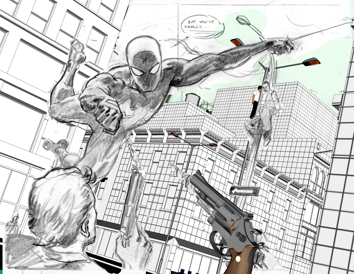
And this is where it all starts, an 8 × 6″ layout that hits all the major notes. You can view the final colored art here. There's even more behind-the-scenes planning that went into the following page, but I'll have to save that for another post.


Great art like always! Thank you for sharing your work process.
ReplyDeleteI'm studying drawing on my own with the help of books and websites, and you made me lose my worries about using reference for difficult anatomy and perspective (I used to think that pro artists like you always did everything "by the book", without using reference to make things more simple).
Please keep sharing them! Best wishes from Brazil! :)
Reference is the key. And the more you use it, the less you'll need it. Thanks!
ReplyDeleteI wanted to thank you because of you I learn a lot how to do and the way to do some great conposition
ReplyDeleteBIFCO, you're quite welcome. Glad I could help.
ReplyDelete