Marvel Mystery Comics
Thursday, February 19, 2009
Labels: Color / Color Studies / Covers / Digital Color / Technique
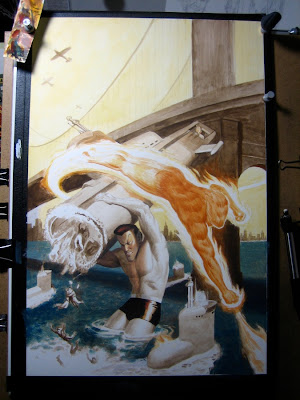
This is one of the covers I've been itching to post for a while. Some of you caught a sneak peak at the New York Comic Con, but here is the official unveiling: Marvel Mystery Comics 70th Anniversary Special #1. It should be hitting shelves May 20th.

I took some progress pics along the way that I thought I'd share. The paint is applied very thinly, leading many people at the last con to think my originals were just prints. I guess I just like conserving paint — I'm still using most of the small tubes from my first Acryla Gouache purchase back in mid-2006.

I'm pretty set in my ways by this point: I almost always begin each piece with a sepia gouache under-painting. My only exceptions are for very bright subjects, such as fire, for which I use permanent yellow-orange and touches of burnt sienna. It helps to keep the final piece from getting too muddy, especially with transparent mediums. I remember noticing back in high school that Alex Ross would paint his entire compositions in black, with the exception of red objects,such as the Flash, which were rendered in their final target colors.

This is the pencil drawing just before I taped it to the dry-erase board. You can see my trusty magnets holding it in place.

Finally, here is the digital color study that started the whole process. I lobbied heavily for the red band, but they wanted the entire line to have a consistent trade dress. You can see the final product at marvel.com.

That's a shame the red band didn't make it through, but it's still a great piece. It looked wonderful at the con.
ReplyDeleteI have to ask, does the underpainting of sepia ever muddle the final colors? I understand the idea behind going about it this way, but it just seems like it'd be like doing an overlay layer or multiply layer in photoshop: Sure, it gives color, but it's not nearly as vibrant as it can be.
another to add to my list of favorites...
ReplyDeleteDrew,
ReplyDeleteI paint very thinly, so most of the paint is absorbed into the paper, much like watercolor. I'm essentially staining the paper.
However, that muddiness is the reason I paint fire and glowing things differently. Everything else can stand to be a little less saturated.
Alex Schomburg would be proud! This must have been fun to work on ;)
ReplyDeleteGotta say, the yellow of the sky and the blue of the water are a fantastic compliment to each other. Also nice to see the smoldering red of the burnt metal vs. Torch's flame. Excellent piece, Paolo!
ReplyDeleteI agree with Drew and Michael Dooney. Too bad about the Trade Dress, they seem well meaning but have poor execution from what I've seen and actually ruin the cover art in some cases. And Schomburg would definitely be proud. So wonderful in this day and age to walk into a comic shop and see this jump off of the stands...I only wish you could have done all of the covers. Bravo!
ReplyDeleteThanks, Traie. Originally, I was going to do at least one more cover for the 70th anniversary series, but I had to back out early on because of other deadlines. Still, I'm glad they let me do just one.
ReplyDelete