Mythos: Cap, Step by Step, Part 1
Sunday, July 20, 2008
Labels: Color Studies / Digital Color / Mythos / Penciled / Photoshop / Step by Step / Technique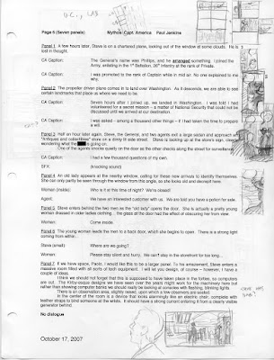
This is the script. This is where it all begins.
Paul Jenkins, the writer of the Mythos series, usually e-mails me in the dead of night with an attached Word document that enthusiastically frames out my life for the next 4 months (if not longer). I'm usually pestering Paul for the script for many weeks beforehand, so he always delivers with a sigh and a familiar phrase, "This is the most difficult script I have ever written," all in a British accent. Yes, he writes in a British accent.
I print it out and sit down for a good read, although not before I shrink the type so that each comic script page fits on one printed page. This makes it easier when organizing my visual thoughts in the thumbnail stage. As can be seen above, I draw directly on the script in a manner that is really only legible to myself. You may also notice that Paul curses freely throughout, something you wouldn't know by reading our book. Sometimes, he even writes it into the dialogue, only to change it later. After all, that's how many people actually talk.
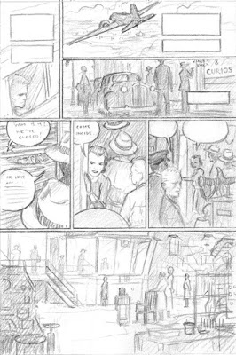
Once I have a pretty solid idea of how I'm going to stage things, I'll do a layout at 4" x 6" in pencil. By this point, I've already done some preliminary research to find out, for instance, what an aircraft of that period would be and, hence, what it would look like. In this case, it's a DC-3 for which I found several different references including a Sketchup model from their 3D warehouse. This is an invaluable resource which I have mentioned in previous posts, and will discuss further as part of this step-by-step feature.
The other element that must be mentioned at this stage is text. If you don't draw captions and word balloons into your layouts, then you not only run the risk of leaving insufficient room in the panels, but also the chance that the progression of your reader's focus will not follow a logical path. This is supremely important when it comes to dialogue since the order in which your characters speak cannot be altered. While not an issue on this particular page, it would play a significant role on the following two pages, which also take place in this secret laboratory.
Finally, I might as well say it: if you know text is going to go there, then you don't have to paint much in that area.
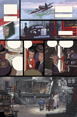
Color is a monster all its own; that's why I divide and conquer. By the time I get to the color study, I've already figured out how to tell the story, where to put the text, the overall page structure, and the individual compositions. Now I'm ready to go in and create a sense of illumination and mood using hue, value, and saturation. I could do an entire blog about color, so I'll try and keep this focused as just another step in the process.
First of all, I'll cover the simple nuts and bolts. I use Photoshop (for which I assume my readers have a basic knowledge) to digitally color my pencil layout. I create a "Levels" adjustment layer to increase the contrast so that the drawing remains visible under color. Above that, I create another layer and set it to "Multiply" mode. I will be coloring on this layer and this allows the dark lines to show through. After that, I create at least 2 more layers, one for text and one for borders. This could all be done on a single layer, but it makes editing easier in the future.
In general, I try to block in the color as quickly as possible. Colorists refer to this stage as "flats." You are basically delineating all the major forms within the composition. Just go with your gut instinct; you can always adjust the relationships later. Once that is complete, then I use "Levels," "Curves," "Hue/Saturation," and "Photo Filter" to play with the colors until it looks "right." Now, to be honest, getting things to look "right" is a subject deserving it's own post, so I'll leave it there so we can move on.
Also, although I didn't do it here, I now create grayscale studies before attempting color. Again it's about "divide and conquer." You can see an example of this here.

Okay. We're not even halfway through yet and I'm already tired of typing.
We're to the penciling stage now. I take the color study and print it out at full size: 10.5 x 15.9375 inches. Actually, that's not entirely true. I often print it out slightly smaller so that I have a bit of wiggle room to play with. Since I create my panel borders digitally, I need to leave room along the perimeter of each panel that I can afford to lose. I trace the printout, using a lightbox, onto Strathmore Series 500 Bristol Board, 3 ply, vellum surface. It's a mouthful, but it's important. The 3-ply is thick enough to take paint, but thin enough to allow tracing. It's 100% cotton, so it won't buckle too much when wet and will age well. The vellum surface provides a nice "tooth" against which your brush can work.
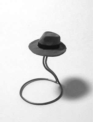
Other than that, I'm basically just cleaning up my lines. I tighten things where I need to and redraw if necessary, incorporating the telling details from my mountains of reference. That DC-3 needs to look right, as well as the mens' coats and car. I even sculpted a miniature fedora because I couldn't seem to wrap my mind around that beautifully complex, curved form.
The only photo reference that I took was for panel 5... but I doubt my girlfriend would want to be a part of Wacky Reference Wednesdays, so I'll spare her.
I should also note that I'm drawing for myself here, meaning that I'm leaving certain parts open to interpretation because I know there are some decisions I can't make until I'm in the thick of painting. As a result, I'll draw hands, but not fingers, a horizon, but no clouds. The important things are perspective and gesture. What else is there, really?
There is also something I'm not telling you about the last panel. Some of you may already know, so feel free to speak up, but I will tell all before this feature is through.
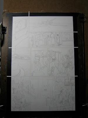
Once the pencils are complete, I tape the paper down to masonite (although I now use my magnet board). I use 1/8" tape to keep my panel borders masked and thicker tape along the edges. My digital borders will be roughly twice as thick, allowing for the overlap that I mentioned above.
We will continue this Friday with the painting process. I'm thinking this will take about 4 posts in total and I encourage you to ask questions if you have any along the way. Thanks.
Update: Part 2


Most of my questions deal with your approach to painting on the final layout, so I will wait in anticipation for this Friday for the painting process run through.
ReplyDeleteThanks so much for sharing this behind the scenes process to your art.
I don't have any questions but just wanted to say that this is fascinating, even from a potential writer's perspective. I look forward to understanding more about your processes.
ReplyDeleteHey Paolo,
ReplyDeleteThis is such a great post. Thanks for all the insightful information. It’s actually quiet funny because my process to penciling a page isn't that far from yours. I too start off at the same foot by making really small sketches on the script, then moving on to another new sheet of layout paper at about almost the same dimensions (I’ll send you a copy of what my layout paper looks like, of which was given to me by another artist), then after I’m satisfied with my layout I blow it up to 10”x15” and use my trusty light box, that’s stored in the back of my utility belt. LOL.
Also as for reference let me say that Google Sketchup is such a great tool, it is a must have if you really want something to be accurate. At times I too need some type of vehicle or building reference that a picture just can’t help alone and I usually print out my sketchup model in frame mode to really understand the curved lines around the form.
Thanks again for sharing this with everyone.
Manny